There's shorthand for just about everything in this day and age. In the process of creating a new letter for the alphabet, I was inspired by common suffixes that could be combined into one letter to make words shorter. I chose the suffix "ing", due to its fairly common use as an ending (see what I mean?). Using the letters i, n, and g in Serifa, I created a capital and lowercase letter to represent it. The letter is pronounced the same as "ing", and can be used to shorten the use of a common suffix in words.
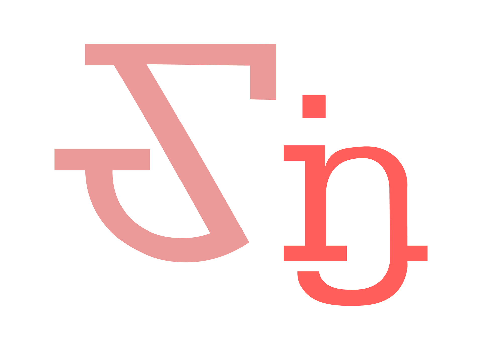
Capital and lowercase form of "ing"
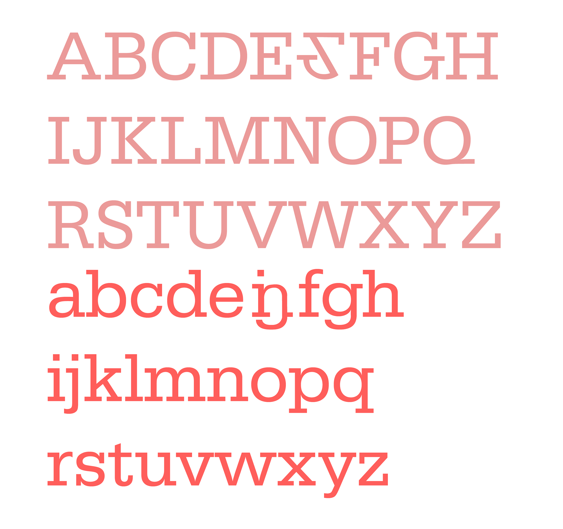
"ing" placed into the existing alphabet

Test sketches of layered letters
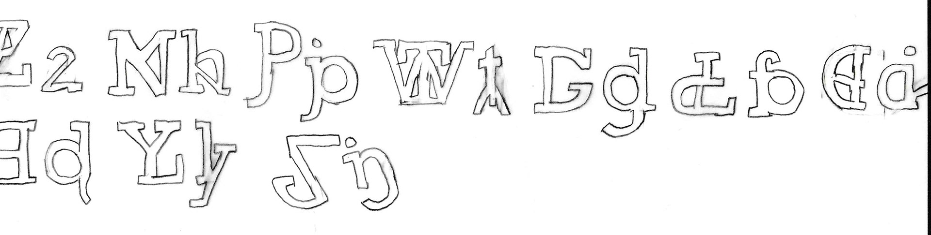
Layered letters traced in serifa
An important part of creating the letter was to make sure it could blend in with the existing alphabet in Serifa. Keeping the line thickness consistent was sometimes challenging, as was deciding where to place serifs so they didn't look "off" compared to the rest of the existing letters. Placing it within the alphabet was the biggest challenge, though. Being mindful of both letters, I placed it between E and F. The uppercase "ing" has a similar top line and serif to the two letters. For consistency, "ing" remained in the same place in the lowercase alphabet, as placing it in the second line of letters made it too descender-heavy. The dot in the i made a nice balance among the existing ascenders in b, d, f, and h.